
Recommended
More Related Content
What's hot
What's hot (20)
Viewers also liked
Similar to Web Construction – Where Do You Begin
Similar to Web Construction – Where Do You Begin (20)
More from butest
More from butest (20)
Web Construction – Where Do You Begin
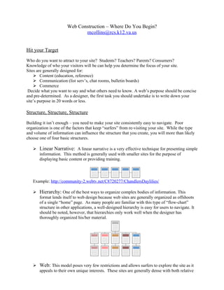
- 1. Web Construction – Where Do You Begin? mcollins@rcs.k12.va.us Hit your Target Who do you want to attract to your site? Students? Teachers? Parents? Consumers? Knowledge of who your visitors will be can help you determine the focus of your site. Sites are generally designed for: Content (education, reference) Communication (list serv’s, chat rooms, bulletin boards) Commerce Decide what you want to say and what others need to know. A web’s purpose should be concise and pre-determined. As a designer, the first task you should undertake is to write down your site’s purpose in 20 words or less. Structure, Structure, Structure Building it isn’t enough – you need to make your site consistently easy to navigate. Poor organization is one of the factors that keep “surfers” from re-visiting your site. While the type and volume of information can influence the structure that you create, you will more than likely choose one of four basic structures. Linear Narrative: A linear narrative is a very effective technique for presenting simple information. This method is generally used with smaller sites for the purpose of displaying basic content or providing training. Example: http://community-2.webtv.net/C8720277/ChandlersDaylilies/ Hierarchy: One of the best ways to organize complex bodies of information. This format lends itself to web design because web sites are generally organized as offshoots of a single “home” page. As many people are familiar with this type of “flow-chart” structure in other applications, a well-designed hierarchy is easy for users to navigate. It should be noted, however, that hierarchies only work well when the designer has thoroughly organized his/her material. Web: This model poses very few restrictions and allows surfers to explore the site as it appeals to their own unique interests. These sites are generally dense with both relative
- 2. and absolute hyperlinks. These webs target highly educated or experienced surfers, and can be confusing to novice surfers. It is good practice for Web Designers to create a “model” of their site long before they ever open the first HTML editor. Flow charts, index cards and sticky notes are among a designer’s most useful tools! Tips for the New Designer: Prioritize information from general to specific. Divide your information into small, digestible chunks. Most users opt to print sites with pages of text rather than take the time to read the information online. o Small chunks of related information are easier to categorize and “funnel” into a consistent organizational scheme. o Link your “chunks” to one another if the related information is approximately one to three pages. o We HATE to scroll! Keep your information clean and concise. Long web pages tend to be disorienting. http://web.archive.org/web/*/http://oasis.leidenuniv.nl/general/index-search/searchrs.htm A uniform format for presenting your information allows a surfer to apply his past experience with your site to predict how an unfamiliar section will be organized. o Familiarity breeds comfort! o Surfers who feel comfortable in a web environment are more likely to return to it – and bring their friends! o Disorganization = surfer frustration. http://www.rcs.k12.va.us/ Proper web site “balance” is the key to a successful design. o Hierarchy should feel natural to the visitor. o Main Menus that are too “deep” will lose visitors – having to navigate through many layers of nested menus before finding what you need is unnecessary. o Menus lose their value if they don’t carry at least four or five links. How well do you connect? Once you have determined the general structure of your site, it’s important to decide how your visitors will travel through it. Placement and type of hyperlinks can make or break your web site.
- 3. Links Text o Most sites use text for both relative and absolute hyperlinks. o Text should sharply contrast page background. http://www.geocities.com/Athens/ Aegean/2221/index.html o Text and font should be consistent. o http://www.nicemice.net/amc/soapbox/html-abuse/fonts.var font abuse should be a crime… Graphics o Graphics are easy to hyperlink but must transcend language. “Next page” “Previous Page” o These links are useful in linear sites. They minimize viewer choice and offer the site designer some measure of navigation control. Navigation Bars o Offer consistency between pages o Allow for a clean, professional look http://www.superkids.com/aweb/tools/math/index.shtml Link Placement o Links that are scattered throughout a page give the reader a sense of dis- organization. http://www.python.org/~guido/ o Absolute links (those that link away from you site) should be placed strategically. Absolute links from the “home” page may take visitors from your site before they ever view your information. Make sure they work! o Nothing discourages web site use like broken links. o Four out of ten pages on a site have a broken link. http://web.archive.org/web/20040607183322/www.frickell.com/oldancient/links.htm There’s No Place Like Home…. All web sites are organized around a “home” page. This page is the entry point of your site and requires a great deal of consideration. First Impressions: Like it or not, your home page is the face you show the world. Take the time to make a good impression. o Eye appeal is critical. http://www.personal.psu.edu/staff/k/j/kjr106/index.html o Take the time to notice spelling and grammar. o Like it or not, 6 inches is all you can count on. http://web.archive.org/web/*/http://www.geocities.com/Heartland/Hills/2710/Gui neaPig.html o 10 second download or they’re gone. o Design to the lowest common denominator: 800 x 600
- 4. View in different/older versions of a browser before publishing Your home page should be the first one you develop and the last one you finish. Common Mistakes Stay Current In this day and age, information changes faster than a speeding bullet. Successful web sites are frequently updated and their designers make an effort to draw the surfer’s attention to new features. o Timestamps o “What’s New” Page o Use “new” graphics sparingly – too much of a good thing is a bad thing! Complete Construction Before Posting A site that has ‘under construction” postings on every link from the home page is a site that was posted in a rush. Guarantee They’ll leave without a trace o Long down-loads o Broken Links o Graphics that don’t work o Loud pages http://www3.ns.sympatico.ca/dstredulinsky/home.html o Spelling errors o An emphasis on ANYTHING but content. http://vervex.blix.com/ads.html Good web sites are like gardens; they are always a work in progress. References (1999) Building a Better Site. Web Site Journal [Internet] June 2, 1999, Vol. 2, No.22. Available from: http://www.WebSiteJournal.com (1999) Point Your Visitors In The Right Direction. Web Site Journal [Internet] June 2, 1999, Vol. 2, No.22. Available from: http://www.WebSiteJournal.com (1999) Are Your Links in Synch? Web Site Journal [Internet] June 2, 1999, Vol. 2, No.22. Available from: http://www.WebSiteJournal.com Lynch and Horton (1997) Yale Style Manual [Internet] January 31,2001. Available from: < http://info.med.yale.edu/caim/manual/contents.html>