1. Final Fonts
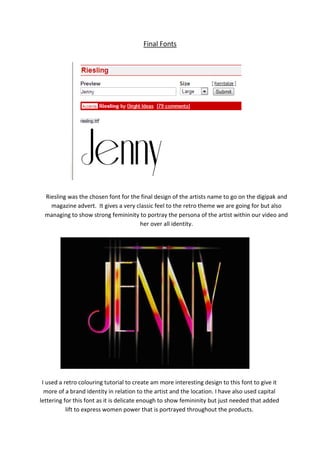
Riesling was the chosen font for the final design of the artists name to go on the digipak and
magazine advert. It gives a very classic feel to the retro theme we are going for but also
managing to show strong femininity to portray the persona of the artist within our video and
her over all identity.
I used a retro colouring tutorial to create am more interesting design to this font to give it
more of a brand identity in relation to the artist and the location. I have also used capital
lettering for this font as it is delicate enough to show femininity but just needed that added
lift to express women power that is portrayed throughout the products.