1. Brand Identity
Part 1: Project
1. Brand Name: My brand name is Mame-B International. Although my
company name is named in memory of my grandmother, I will convey this
unique brand through my brand name by storytelling usage. In the company
history, I will indicate how I derived at naming my business after my
grandmother by explaining the story of when I was a fourteen year old, shy
youth, my grandmother would encourage me to be more extroverted, live life
and have fun. Also, she was the first person in my life that taught me the
importance of good health and nutrition through her example. The strength
of this name indicates that the name is part of my family history and it is in
honor of an individual whom I love and care for dearly. I am concerned the
name itself does not tie in with the symbol and the kind of impact this may
have on my sales. Yes, the name is protectable. I am going to conduct further
research to determine how to protect the copyright of the name and
trademark. Based on the category of Pursing Strong brand, the brand name
falls in the generic category.
2. Logo: The laws of color are supported by using a color different than our
competitor. One of our competitors is General Nutrition Center (GNC). Their
colors are red and gray (The GNC letters are written in red uppercase letters
followed by the words Live Well in gray upper and lowercase letters). These
words are all written in a rectangle. Therefore, red and gray will not be our
colors. I will, however, use the rectangle. This will be an effective logo
because it will capture the essence of what this business is all about. A
pictorial mark would best suit my company’s logo. My logo reflects my
company’s unique brand because it provides a representation of what my
company symbolizes. An example of a logo from our business competitor is
the GNC (General Nutrition Center) logo.
http://upload.wikimedia.org/wikipedia/en/b/bd/GNClogo.jpg An example
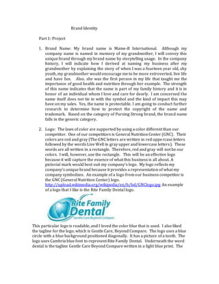
of a logo that I like is the Rite Family Dental logo.
This particular logo is readable, and I loved the color blue that is used. I also liked
the tagline for the logo, which is Gentle Care, Beyond Compare. The logo uses a blue
circle with a blue background positioned diagonally. It has a picture of a tooth. The
logo uses Cambria blue font to represent Rite Family Dental. Underneath the word
dental is the tagline Gentle Care Beyond Compare written in a light blue print. The
2. weakness of this logo is the tagline is not legible because the color blue is too light.
An example of my logo is the
following:
3. Helping People, Healthier Lives
The logo is the name MAME-B International with the word in green. I intend to
create an oval object with black lines and a white background. In side the circle is a
picture of hands on top of one another.
3. Corporate Culture: We are in the business of empowering leaders and not
employees. We believe that everyone should have the opportunity to pursue his or her
individual interests and not be bogged down by a 9 to 5 job. We are in the business of
engaging individuals to find out what their goals and ambitions are and how we can
help them accomplish their goals through our business. Our corporate culture is based
on honesty, respecting people and putting them first, creating a fun and positive
environment, and minimizing conflict. We will accomplish a strong company culture by
complimenting people’s objections and not competing with them. For example, I am
talking with someone to find out what his or her goals and interests are. During the
conversation, I find out the individual does not want to start a business of his or her
own. Instead of trying to convince them to become an entrepreneur, I would thank
them for their time and reinforce positive things about what he or she wants to
accomplish. That way, it would be a win-win situation for the prospect and for me.
4. Mantra Statement: Helping People, Healthier Lives
Mission Statement: We are in the business of empowering leaders to create,
develop, and grow their own business. We believe in free enterprise and that
people can and should work together to accomplish their goals and
4. aspirations.
5.
Helping People, Healthier Lives
This is an effective tagline because it demonstrates that the business is team
oriented and promotes healthier lives. This tagline speaks to both business owners
(Independent Business Owners) and customers because it is designed for both the
health conscience, which could possibly speak to customers who are concerned
about their health. On the other hand, it could speak to a potential business owner
because it promotes working together as a team to accomplish an aspiration. At the
present time, the tagline needs to be more developed to differentiate our company
from the competitor. It needs to be more enhanced maybe to promote organic
consumption, rather than just working together as a team. My future intentions are
to maybe incorporate something organic into the logo, perhaps. The tagline
commands action and is positive, short, unique, and easy to say.
Part 2: Brand Identity Peer Review