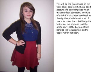
1. This will be the main image on my
front cover because she has a good
posture and body language which
make her look confident. The rule
of thirds has also been used well as
the right hand side leaves a lot of
space for cover lines. I will crop the
bottom of the photo so that the
photo starts at the bottom of her
hand so the focus is more on the
upper half of her body.
2. These photos will go on my contents page. The left hand photo
is a close up in order to be used as the editor’s note. This is
because the main focus will be on his face. The middle photo
will be used to represent the review section of the magazine. I chose this photo because the
lighting is better on it and the props indicate what the article will be about. Finally, I chose the
final photo to represent an article where a reader has their opinion. The style of clothing she is
wearing is appropriate for the target audience and she again has good posture. The style of
clothing and appearance will attract the audience. I also chose this photo because she is nicely
positioned in the photo and will attract a lot of the focus.
3. The main photo for my double page spread will be the photo
with the guitar as it is an action shot but also focuses on the
guitar. I chose to have her with her eyes closed because a
lot of artists close their eyes when they perform and it looks
more realistic.
This will be the secondary image on the double page
spread because it uses a different shot type – a two
shot which attracts more attention. It also contrasts
to how the model is in the main image as here she is
smiling compared to performing. The lighting of this
photo is good as the background isn’t too dark or
overexposed.
4. I decided not to use these images. The left hand image
catches the skirting board of the background in and gives
the image an uneven feel. The right hand image is not
positioned well as the guitar is far over to the right but
the model isn’t centred and is quite low on the photo.
The guitar available at the time of this photo shoot was an
acoustic guitar which didn’t fit the genre of music my
magazine is.
5. I chose not to use the photo with
the guitar as the edge of the
guitar is cut off. The lighting of
the image is also quite dark so it
doesn’t have the impact that was
intended.
I didn’t use the photo
above because even I chose not to use this close
though it was an action up image because it is
shot and it caught her shadowed and doesn’t
laughing, her body highlight his face as much as
language is quite plain I wanted it to for the editor’s
which leaves a lot of white choice photo.
space around her.
6. I chose not to use the photo on the left for my front
cover. I liked how confident her body language was but
the position of her arm leaves too much white space on
the left hand side of the photo and makes the photo look
like it’s not in the centre.
I chose not to use the photo on the left because again
the skirting board of the background was caught in it.
However, I could have cropped this but I also didn’t
choose it because the end of the guitar didn’t fit in the
frame without making the photo a longer shot than it
already was meaning the floor would have been visible.
7. I didn’t use the photo on the left because it
was too dark and the flash reflected off od
the CD cases.
I chose not to use the photo on the right
because I thought he had too many CD’s in
his hand so it wasn’t easy to see what they
were; especially the one at the back. I also
didn’t choose this photo because the top of
his hair has been cut out of the photo.
However, I did like this photo for his facial
expressions.