
Recommended
More Related Content
What's hot
What's hot (17)
Viewers also liked
Viewers also liked (20)
Similar to Kerrang Double-Page Analysis
Similar to Kerrang Double-Page Analysis (20)
More from alyblue98
More from alyblue98 (20)
Recently uploaded
Recently uploaded (20)
Kerrang Double-Page Analysis
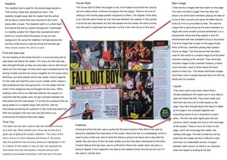
- 1. Main Image There are four images that have been on this page. The main one that is bigger than the other two shows one of the band members playing his bass at a one of their concerts and gives the effect that he looks as if he is surrounded by fans. The second image that is used shows all the band members on stage with some smaller pictures embedded in to it showing the venue that they played in and the merchandise that was available to buy at the shows. The third image that is used on this page shows three of the four members playing their guitars/ drums on stage. The final picture that has been used for this article is a simple image of all the band members looking at the camera. They have also included images of the continent America, a black cross has been used to show where the band played on their tour. The reason that these images have been used is simply because they link with the article and its contents. Headline The headline that is used for this double page spread is “Fall out Boy make their sensational return” The headline straight away tells the reader that this article will be about a band that have returned to the music scene after a break. The headline itself is in a bold black font behind the text is a yellow background. Underneath in a slightly smaller font “Make their sensational return” which is in a bold white font placed on top of a red background. By using this headline it will get people who are fans of the band to read the article but will also get other people reading the article as well. House Style The house style of these two pages is very much based around the two colours red and yellow which continues throughout the two pages. There is not a lot of writing on this double page spread compared to others. The register of the story is an informal piece of text as it an interview between two people. In this spread it would be the interviewer and the interviewee and the reader will want to know why this band in particular has returned, as this is the main focus on this story. . Drop Cap The letter that has been used to start the article of is known as a drop cap. Many articles use a drop cap as they are a good way of getting the reader’s attention. The colour of the text is red as it is still in keeping with theme of the article. Also the questions that are being asked are highlighted in red so it easier for the reader to read as they can separate the interviewer from the interviewee in the text without both questions and answers blending in with the rest of the text. Features During the article the text uses a quote that the band member Pete Wentz has said by doing this highlights the importance of this quote. Above the text is a subheading, which is used to give a brief over view of what the article is going to be about and it also tells the reader why this piece of text has been written and who has been interviewed of this story. Another feature that has been use if a puff which informs the reader what new story is going to appear In the magazine next wee so the readers knows and will go and buy it if hey want to red the story. Layout They have used a very basic layout that is visually pleasing to the reader and is very easy to read and follow the text. They have made sure that there are not a lot of white space on the page, they have thought about the layout in detail as the page is not cramped together and everything seems to be in proportion to each other. The text has been tightly pact into two columns, which merges into one on the next page of the spread. There is not a lot of text on the page, which will encourage the reader into reading that page. The text is small but not too small that the reader will find it difficult to read and there is a reasonable amount of space between each column so there is no confusion when the reader is looking at the text Font and type size For the heading of the article the font is a nice and easy font to read which will attract the reader. The colour for the fonts has been thought through as they are very basic colours that should stand out from the page. As they have used a background for the writing it made sure the two colours together do not cause colour blindness, as some people cannot see certain colours together. For the main text itself the size is much smaller which makes it look professional then having big font, it to the reader that the writer of this magazine has put thought into the story. When reading a story that is an interview between two people it is important that the reader does not get confused between the interviewer and the interviewee. To do this the questions that are being asked is in a slightly larger bold red font, with the interviewee answering the questions in the continuing black font. With the exception from the main text the theme runs continuously throughout these two pages.