
Recommended
Recommended
More Related Content
Recently uploaded
Recently uploaded (20)
Featured
Featured (20)
Here's What A Good Website For Builders Looks Like
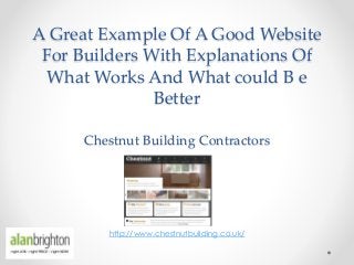
- 1. A Great Example Of A Good Website For Builders With Explanations Of What Works And What could B e Better Chestnut Building Contractors http://www.chestnutbuilding.co.uk/
- 2. Introduction • The Chestnut Building Contractors serves South London • Their services include, but are not limited to, renovations, extensions, electrics, decorations, kitchen & bath • Their website is simple and direct – they have the essentials • They use testimonials, contact form, simple navigation, customer-focused copy, good photos and persistent (but not so obvious)calls to action • They have sufficient and relevant copy but for better SEO, it wouldn’t hurt to add more
- 3. Top of the home page only: http://www.chestnutbuilding.co.uk/ Clear logo, present on every page to tell people where they are Simple, easy to understand main menu – aids navigation Good quality photo but is it interesting? Interactive slide – you can go back and forth – easy navigation Clear, simple quick links – makes it easy for visitors to get to the page they want to be Speaks directly to visitors – uses ‘you’ Good offer. ‘Click here’ link is obvious enough. Effective attempt to increase conversion BUT THERE’s NO PHONE NO – AAARGHHHH !
- 4. Bottom of the home page only: http://www.chestnutbuilding.co.uk/ Testimonials help build web credibility – essential for conversion. Good placement. Using full names or initials + last names make testimonials more believable / genuine Contact details, quick links and contact form are present on every page – good navigation and attempt to increase conversion Maps make it easy for people to locate you – useful information Good form – short and simple. Required fields are labeled to avoid friction Send button should stand out and captcha is not necessary
- 5. Middle part of the why us page only: http://www.chestnutbuilding.co.uk/why-us/ Clear and useful quick links Simple way to get your visitors’ attention – make your first paragraphs bold Good, relevant photo. Size is just right, not too big, not too small Simple words, short sentences and paragraphs, readable typeface, uses ‘you’, talks about benefits
- 6. Middle part of the services page only: http://www.chestnutbuilding.co.uk/our-services/ Good layout – provides easy navigation. ‘Read more’ links are obvious. Photos are relevant
- 7. Middle part of the specific service page only: http://www.chestnutbuilding.co.uk/where-we-work/ Relevant photo, if a little bland Clear headline Good testimonial placement, great reference to architect Good navigation – easy for visitors to go from one service page to another Easy to read service description – good use of copy. More relevant copy = good search engine optimisation (SEO)
- 8. Middle part of the specific service page only: http://www.chestnutbuilding.co.uk/work/painting-and-decorating/ Telling visitors the areas you cover helps them with their decision making – helpful information
- 9. Middle part of the testimonials page only: http://www.chestnutbuilding.co.uk/testimonials/ Nice testimonial page design/layout Typeface consistency – they should stick with non-italics, besides they’re easier to read Using full names or initials + last names make testimonials more believable / genuine
- 10. Middle part of the contact page only: http://www.chestnutbuilding.co.uk/contact-us/ Using short and simple contact forms help boost conversion Complete contact details – very important (their address is provided with a map at the top of this form) More people will use this form if they improve their Send button and if they remove captcha Contact forms can work – BUT asking for a phone call will almost always get better results
- 11. Website reviews • This website review is our opinion and everyone has opinions of course. The intention here is to help you as a builder, plumber, electrician or other trade professional understand what will work in website marketing • Our opinions are based on direct experience over many years and extensive research using some of the best marketing resources around the world, but only those that test their results. Theory is nice but it doesn’t bring home the bacon • If we cause offence we don’t mean to, but you should see the website critiques of sites that we know are poorly constructed (we only pick on non UK sites in this way) • If you look at our website (www.alanbrighton.com) you’ll probably say what do they know, but it works. If you could see what would get you the best possible results you’d be shocked, but then maybe you’d get rich.