UiPath Community: Communication Mining from Zero to Hero
Magazine cover
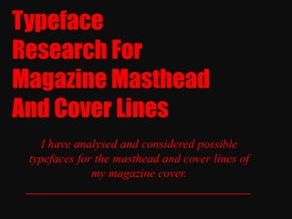
1. Typeface
Research For
Magazine Masthead
And Cover Lines
I have analysed and considered possible
typefaces for the masthead and cover lines of
my magazine cover.
_____________________________________
2. Typeface
- Masthead -
This font is called ‘Hollavetica’. It is bold and big but by having some areas
scratched out and some areas darker/lighter than others, the font creates a sense
of distortion and originality. This would work well as the mastheads typeface as
target audiences would find it eye-catching and unique (Two factors they also
mentioned during my research). However, my magazine is informative and for a
mature audience (such as Sight & Sound magazine) thus my audience may not
appreciate such a heavily styled and fairly complex typeface.
________________________________________________________________
3. Typeface
- Masthead -
This tall, thin typeface is called ‘Crackin’. The slender style of the lettering
presents it as elegant and neat. However, the letters are set on different levels
creating a sense of distortion and eeriness. The typeface is easy to read
(preferred by my target audience) and could be ideal for the masthead but it
lacks originality which would be a potential drawback if the magazine was
real and on sale amongst other magazines with similar typefaces.
_______________________________________________________________
4. Typeface
- Masthead -
This funky, bold font is named Fabianestem. The lettering is squashed together
and parts of it has been cut out but ‘Masthead’ is still readable, this typeface is
bold but still fun and interesting to look out- a unique element that my target
audience appreciate- thus this could be ideal for the font of the masthead. It
may be seen as slightly quirky but it is still bold, clear and fresh whilst
connoting a light sense of sophistication.
_______________________________________________________________
5. Typeface
- Masthead -
This typeface is called Impact Label. The thin, clear lettering is separated from
each other neatly and the letters are all seated on the same level- showing
organisation and increasing clarity. Also, the letters are white on a black
background which makes them stand out and enables them to be easier to
understand. My research shows that my target audience appreciate a clear,
neat typeface thus this could be ideal as it is also original and stands-out.
_______________________________________________________________
6. Typeface
- Masthead -
This typeface is called Bellerose. The letting here is neat, tall and organised.
The letters are not joint thus they are easier to understand. However, the
roundness of some of the lettering can be seen as feminine and this would
cause the font to only attract a niche female audience rather than both genders
of my target audience. This is important as my research shows that my target
audience prefer neutral typefaces. Thus this font may not be suitable to use for
my magazines masthead.
_______________________________________________________________
7. Typeface
- Masthead -
This font- ‘All Ages’ – is immediately eye-catching because of the white
lettering set upon a black background that is part of the font. The bold letters
are in capitals and are separated from one another- making them even more
clearer and easier to understand. However, the typeface may be presented as
‘too young’ for the mature-type audience of my target audience. Then again,
they may appreciate the unconventional edge given by this font and it may be
the reason for them to purchase the magazine.
_______________________________________________________________
8. Typeface
- Masthead -
This typeface is called ‘Nova Solid’. The dark, sharp lettering is bold and
neatly-organised, making it eye-catching and simple to read. Some parts of the
letters have been blocked out completely and this creates a sense of edginess
for the font as well as originality and the word can still be read thus my target
audience are likely to appreciate this typeface as it fulfils a range of their
preferences.
_______________________________________________________________
9. Typeface
- Cover Lines -
The typeface for cover lines is conventionally simpler than the mastheads and
easy to read & understand. This typeface is called ‘Bebas Neue’ and its
lettering is bold and structured neatly. The letters are not joint together
allowing it to be easy to read even in a smaller size. Also, by being tidy and
clear, my target audience are likely to appreciate it as the font for the
magazines cover lines.
_______________________________________________________________
10. Typeface
- Cover Lines -
This typeface is called ‘Glasket’. The lettering is mostly small with some
characters taller. The font is rounded and that combined with its pettiness
connotes it as being slightly feminine and this may cause it to not attract the
full range of my target audience (both genders). Also, the delicacy of the
typeface means that if the font is made smaller in size it may loose some styling
and could be difficult to read (not appealing to my target audience). Thus, this
may not be an ideal choice for the cover lines typeface.
_______________________________________________________________
11. Typeface
- Cover Lines -
This wide, neatly structured typeface is named ‘Tommy Hilifiger’. By spacing
out the letters and allowing them to be in capitals whilst being thing and tall,
the font is presented as easy to read & understand in all sizes and colours.
Also, the typeface has some rounded characters but some sharp, edgy
characters too and this blend enables it to be a neutral font which would be
ideal as both genders of my target audience would find it appealing.
_______________________________________________________________
12. Typeface
- Cover Lines -
This typeface is called ‘Will & Grace’. The lettering of this font is near and
aligned. It is not tall and is simple but the vowels of the word have been
automatically made italic-giving it a sense of edginess and uniqueness that my
target audience would find appealing. Also, the font is neutral and would work
well in all sizes and colours and would appear eye-catching amongst other
magazine covers.
_______________________________________________________________
13. Typeface
- Cover Lines -
This bold typeface is called ‘Hursheys’. The lettering is curvy and neat making
it simple to read and understand. However, the letters are positioned tightly
together and this may cause difficulties in reading if the font was used for
words of a smaller size. Although the letters are curvy they do not connote
direct feminism and because they are in capital letters and solidly aligned on
the same level, they present a sense of solidness and toughness that would
make the typeface neutral and appealing to both genders. Thus is could be
appreciated by my target audience and ideal to use for my magazines cover
lines.
_______________________________________________________________
14. Typeface
- Cover Lines -
Another important factor in cover lines is whether they should compliment the
mastheads typeface or contrast it. This typeface is called ‘Kiona’. The lettering
is spaced-out and aligned neatly. Some of the characters are sharp whilst
others are curvier. This creates balance and a sense of neutrality that both
genders of my target audience would appreciate. Also, this font would work
effectively in a range of sizes and it clear to read but the sharpness still allows
it to have a vibe of edginess and the tallness still allows a sense of
sophistication. Thus, this could be an ideal typeface to use for the cover lines
on my magazine cover.
_______________________________________________________________
15. - Conclusion -
To sum-up, through my typeface research for my magazines masthead and
cover lines, I have explored typefaces that are conventional, tidy, edgy and
unconventional/original. Throughout considering my choices, I have given
importance to my market research as my objective is to meet the target
audiences needs as this will ensure a successful magazine cover. For the
masthead, I have decided the typeface must be eye-catching, original but
clear, bold and neutral. This will allow the magazine to stand-out amongst
other covers but will still ensure my older target audiences can read and
understand the magazines name. The magazine cover I have chosen to
create is for a magazine that is aimed at 17+ audiences who are interested
in learning about the technical areas of film-making a bit more than the
showbiz areas. The magazine connotes a sense of seriousness with
attraction and fun and I have decided to use a cover line typeface that is
simple but edgy, neatly-organised and neutral. Thus attracting a maximum
range of my target audience and enabling their desire to ‘purchase’ the
magazine.
_______________________________________________________________