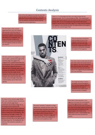
1. Contents Analysis
Each of the vibe magazines has kept the same font
size and style in the word “Contents”. They have There is a ‘V’ in the background that is very large and grey like the
done this in order to keep brand identity and so background itself. The ‘V’ is the first letter of ‘VIBE’. This creates brand
that the audience can become familiar with the identity and will grab attention from the reader to make sure that they are
magazines contents page layout. reading ‘VIBE’. The V in the background is big and bold reflecting the
magazine and the artists it promotes. Again it is a unique feature that gives
the magazine its own identity and style. The target audience will recognise
that this is the contents page of Vibe.
The main feature of the contents
pages featured in vibe is the celebrity
who was also on the front cover of
that particular edition. This will be a
well known celebrity of the genre that
vibe features in its magazines. The
There are key layout conventions
reader will quickly recognise this
used including the name of the
celebrity and may be more inclined to
magazine, when the issue was
buy the magazine as they are a fan of
published, the title of the page
the celebrity.
(Contents), categorised articles and
small print at the bottom (including
the website of the magazine).
The font used for the categories is script
and so adds a sophisticated edge to the
contents page and suggests the The colour scheme is kept quite dull and
magazine has a sophisticated side to its dark which reflects the overall mood of
brand identity. This is unconventional of the magazine. The colours themselves:
Hip-Hop/Rap magazines because a Black, grey and blue, are normally
different font is normally used, such as associated with being very masculine
a simple sans serif font. This will draw colours. This suggests that the readership
too is very masculine.
attention from the reader so the
categories will be easily seen and read.
However this is the font that vibe
usually uses so through it they have
created another part of their brand
identity. The image information is kept at
the bottom of the of the page as
this is the least important piece of
information on the page, its
needed but most readers won’t
have any interest in reading it.
The layout of the contents page follows
Vibes own traditional layout conventions. Kanye West’s facial expression is very
aggressive; this shows him to be powerful
The vibe contents page layout
and strong. Aggressiveness is a quality
conventions are; to have a large “V” in
The word “contents” is placed in a large audience usually associate with masculinity,
the background to stand for the
display font, and laid out over 3 lines. The this relates to the target audience as they are
magazine name; this V will be a different mainly male with the exception of a few
font itself looks masculine and that sense
colour to the contents page background female readers. He is shown to the
is enhanced through the colour of the
colour to stand out to the audience. The readership in a semi – casual designer suit,
font: black, which is known to be a
text layout on the page is simple. The which shows him to be successful and
masculine colour. The font is edgy and
sections of the magazine are placed wealthy.
unique which reflects the magazine to
either on the left side or the right side of
have these same qualities as well.
the featuring artist. The heading for the
sections of the contents is placed in a
script font.
2. Each of the vibe magazines has kept the same
font size and style in the word “Contents”. They The word “contents” is placed in a large There is a ‘V’ in the background that is very large
have done this in order to keep brand identity display font, and laid out over 3 lines. The and red like the background itself. The ‘V’ is the
and so that the audience can become familiar font itself looks masculine and that sense first letter of ‘VIBE’. This creates brand identity
with the magazines contents page layout. is enhanced through the colour of the and will grab attention from the reader to make
However the layout on this contents page is font: black, which is known to be a sure that they are reading ‘VIBE’.
slightly different to other issues and other masculine colour. The font is edgy and
magazines, in fact, with the contents listed on unique which reflects the magazine to
the left not the right. This shows that Vibe is have these same qualities as well.
not afraid to break ‘the rules’ and do things
differently, just like its target audience. It also
reflects the unique star image of the artist
featured.
There are key layout
conventions used including the
name of the magazine, when
the issue was published, the
title of the page (Contents),
categorised articles and small
The category names for each type of print at the bottom (including
article are in san-serif font. This is the website of the magazine).
unconventional of Hip-Hop/Rap
magazines because a different font is
normally used. This will draw attention
from the reader so the categories will
be easily seen and read. However this is
the font that vibe usually uses so
through it they have created another
part of their brand identity.
The image information is kept
at the bottom of the of the
page as this is the least
important piece of information
on the page, its needed but
most readers won’t have any
interest in reading it.
The articles are placed in the left hand side
of the page. Artist’s arm is there instead, of
a normal space between the article features
in the magazine. This is unconventional. The
artist is in the centre of the page so they
stand out and dominate the page.
The background colour is a masculine dark red; this
reflects the magazine and is suitable for the target
audience as they are mainly male therefore it will
attract them. The colours; dark red and white are
known to be masculine colours and will therefore
appeal to the audience.