1. Photography Lighting
Salford City College Ryan Denner The photography used shows the band members
Eccles Centre holding skulls which are associated with death and,
AS Media Studies
Foundation Portfolio
danger suggest what the article is about. They are
both wearing identical black leather jackets to show
Masthead---------------------------------------------------- what genre of music they fit into while also making
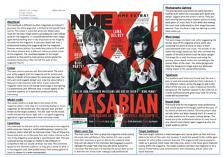
The masthead is different to other magazines as it doesn’t the cover look professional as their image has been
go across the entire page and, is limited to the top left hand planned. They are show in high key lighting to make
corner. This makes it stand out while also allows more them stand out.
room for the main image which is probably the main selling
point for the magazine. It is located behind the main image Main image
again demonstrating that it is as important as the image to The main image is in black and, white suggesting the
the sales for the magazine. It uses plain black text and, a serious tone of the magazine article, while also
professional looking font suggesting that the magazine connoting the genre of music as black is often
features serious articles. It is made this colour to fit in with associated with indie rock music. The streaks of red
the colour scheme and, is different colours on other issues makes the image stands out and, also connotes the
of the magazine. The masthead appeals to the target subject of the article which could be about danger.
audience as they want to read serious articles about the The image fits in with the house style using the
musicians featured so, they can tell the style of the primary colours black, white and red adding to the
magazine from it. overall effect of the cover. The white background
helps the foreground image stand out while also
Colour adding impact to the overall effectiveness.
The main colours used are red, black and white. The black
and, white suggest that the magazine will be serious and, Typefaces
feature in-depth articles about the musicians featured. The The typeface used looks very formal and, the text is
red used could suggest danger and, may hint about what is easy to read and would stand out from a distance. It
featured in the interview with them. It also makes the is in different colours across the page to add to the
magazine stand out as the background image is black giving effect of the text and, to make it stand out from the
it a professional and, effective look. It would appeal to the background. The typeface appeals to the audience as
intended audience as it looks both professional and, it looks professional and, gives clues how the articles
interesting. inside will be presented.
Model credit
The model credit is in large text in the centre of the
House Style
magazine which is how they are commonly display on music The house style for the magazine looks professional
magazines as the models are often big stars and, are well and, would appeal to the target audience because, of
known by the target audience. The text used for the modal its choices of text and colours. The only colours used
credit matches the house style and, is red again suggesting are red, white and black showing that’s it’s aimed at
againwhat might be featured in their interview inside. an older audience as it is quite a simple design. The
layout ass to the professional look as it’s very formal
Coverlines and, doesn’t look childish again suggesting who the
target audience will be.
The coverlines list the rest of the artist featured in the magazine
while some also feature a small headline giving a taster to the
audience, about what will be featured inside. They all follow the Main cover line Target Audience
house style and, are in the same font and, colour scheme as the The main cover line hints at what the magazine articles about The main target audience is older teenagers and, young adults as they are most
rest of the magazine cover giving it a professional look. They are the cover stars will feature. One section of it uses a quote likely to be fans of the cover star however it could also appeal to the middle aged
scattered across the page so, makes it look different to from their interview to give an idea to the audience what because of some of the musicians featured. The magazine will mainly appeal to
competitors that are usually all down one side. The coverlines they will talk about in the interview. Bad language is used to males as in general, more males like indie rock, which is the music genre featured
appeal to the intended audience as they give a taster of what is highlight the anger that they may talk about during the mainly within the magazine. The target audience will want the magazine to be a
in the magazine and, have picked artists from various genres of interview. The text used in it matches the house style so; fits source of information and, entertainment with interesting articles about the
music to appeal to a wider demographic. in with the rest of the cover making it look professional. bands featured.