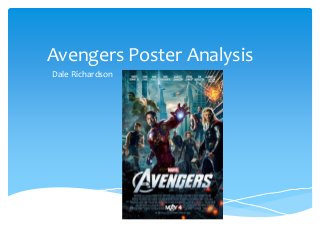
2. This poster uses a sans-serif font style. This is a simple style
of font that would target a masculine audience. The film
name is in the largest font as that is the most important
thing on the poster. The font size of the actors name is
much smaller as it is not as important as the name of the
film.
Typography (Font style and size)
3. This poster uses a wide shot to show all the
characters and the setting. This wide shot helps to
create a hierarchy of sorts between the characters
showing the most popular character at the front of
the picture. The use of the large character in the
background shows a dominant character that relies
on brute force rather than skill.
This is conventional of the action film genre as the
large protagonist characters use forceful techniques
to defeat their enemies while the other characters
would use their abilities and skill to defeat the
enemy.
Image (shot type and mise-en-scene)
4. This magazine poster uses the rule of thirds to
ensure that no character is directly in the middle
of the poster. Iron Man and Thor are on the left
and right vertical line to ensure the poster is
creative and not boring. This is conventional of
action film posters as the characters are never
directly in the middle of the poster but they are to
the right or left of the centre. This helps to draw
the attention to these characters and then allow
the audience to see the background behind them.
The poster uses the route of the eye to show the
character Hulk, in the primary optical area, directly
opposite that horizontally is an explosion that
draws the eye, this then diagonally goes down the
centre of the poster through the main characters
to the terminal area where the title of the film is
placed as well as the small printed information
that is not relevant to the audience.
Layout
5. The poster doesn’t use a particular style of
language it only has the title of the film on it and
the actors names. This is not conventional of
action film posters as usually they have a short
explosive caption at the top or bottom that adds
excitement to the film.
Language
6. This poster uses a variety of colours to draw the
attention of the audience. The use of red, green,
blue, orange, and grey creates an atmosphere in
the poster. The red colour connotes power and
blood which relates to violence and death, these
are both things that are evident in action films.
The contrasting grey creates a dull atmosphere in
the poster as it shows the run down setting the
protagonists are fighting in. This is conventional of
action film posters as the colours used will create
contrasting themes, those being power and
weakness at the same time. The red showing the
power while the grey shows the weakness.
Colour
7. This poster is conventional for a film poster as it
shows the title text of the film to be the largest
text on the poster, this is much larger than the
actors names and the irrelevant information
placed at the bottom of the poster.
The poster is conventional for an action film
poster as it shows all the protagonist characters in
action rather than standing around. This is
conventional as the image is expected to show a
scene from the film rather than it being a photo
shot outside of the film itself.
Conventions of form and genre.