Overheid 2.0 - Kansen met Web 2.0 voor gemeenten en provincies
Typography vc paper (team a)
1. Typography
Hogeschool Rotterdam
Jyona Jacobs
0864397
Sharon Nibber
0848032
Kristen Tjong-A-Hung
Visual Communication
Paper
0864454
Lushka Gibbes Ramierz
0844123
2. 2
Contents
Typography ................................................................................................................... 3
Fonts .................................................................................................................................... 4
Colour................................................................................................................................ 7
What is Typography used for and how is it seen in our
daily lives ...................................................................................................................... 9
Bibliography ............................................................................................................. 14
3. 3
Typography
Typography refers to the
arrangement of text on a
page, and appears in some form or another in all
instances of written communication. Depending on the
purpose, it can be used for optimum readability, impact,
or an artistic statement. Some graphic designers work totally in text, and study how text
is arranged extensively while they perfect their art. Quality design can make a big
difference in communications, because it can
affect the way the reader sees and feels about the
topic being discussed.
At the most basic, typography is a combination of
font, size, spacing, and color. For example, many
online articles use a clear sans serif font
in a moderate size, arranged on the
screen for maximum readability. The
text is black on a pale background,
further enhancing the readability, and
links within the text stand out
because they are underlined and in a
different color. The overall purpose behind the layout of the
article is to clearly communicate written information to a reader.
4. 4
Fonts
There are several families of fonts and only one will be presented, the sans
serif groups. Specifically, only four fonts will be discussed: Helvetica, Arial, Century
Gothic and Calibri.
Helvetica
Helvetica was designed by Max Miedinger on Eduard Hoffmann’s request,
who was the director of the Haas Type Foundry in Switzerland, in 1956.
Miedinger was an artist and graphic designer before training as a typesetter. He
then came up with a design by the summer of 1957, which was a new sans serif
typeface and it was then named ‘Neue Haas
Grotesk’. After which, the design was offered to
customers of the Haas Foundry in Germany. But the
company felt it would be too difficult to sell a new
font under such a complicated name, so they started
looking for a name that would simply embody the
spirit and heritage of the font. Which is how the
company came up with the name ‘’Helvetica’’ (comes
from the Latin name for Switzerland; ‘’Helvetia’’).
Helvetica is now known as one of the most famous
and popular fonts in the world, one of the main
reasons for the immense popularity is that the
design of Helvetica embodies the primary
goal of typography, namely; clear communication.
Usage
Helvetica is one of the most widely used sans serif fonts and has
been a popular choice for corporate logos, including those for American Airlines,
BMW, Microsoft and Orange, just to name a
few.
5. 5
Arial
Arial was originally created for IBM (an American multinational technology
corporation). Arial had been designed by Robin Nicholas and Patricia Saunders
in 1982. But the design had gotten its most important send-off in 1992 when
Microsoft decided to make Arial part of the system fonts for the Windows
operating system. Since that day, Arial has been used on almost every computer
and in every graphical application imaginable.
Usage
The reason for Arial’s popularity is because it is easy to read in all sizes,
which is why it is not only used on-screen. Arial is also often used for advertising,
book design and office communication.
Century Gothic
The century gothic design is very much influenced by the geometric
sans serif styles of the 1920s and 30, which were a part of the post-
Victorian design evolution. The font is also influenced by modern fonts,
which makes Century Gothic easier to use in digital technology.
These influences of both classic and modern styles make Century Gothic
to have a compelling new look and it has the best of both worlds.
Today, Century Gothic is amongst a select group of ‘’core’’ fonts used in
over 90% of all computers. Because of its wide availability, the Century
Gothic design is considered a perfect font to use in websites.
Usage
As you can see, Century Gothic has a very open and friendly
design, which is why you will often see this font used in television show
logos or media titling.
Even the logo for the
James Bond film
‘’Casino Royale’’
used Century Gothic.
6. 6
Calibri
Calibri was designed by typographer Lucas de Groot in 2002 for Microsoft.
De Groot then devoloped a subtly rounded and curved font, which worked
astonishingly well for Microsoft, after which they decided to use it in their
flagship product; the Office suite of solutions. Since then Calibri has become one
of the most prominent fonts in current use.
Usage
Calibri is the default font for Microsoft Office since 2007. It is also used as
default font for all other Microsoft software, such as; PowerPoint, Outlook and
Excel.
7. 7
Colour
Colour derives from the spectrum
of light, as it is reflected or absorbed,
interactingby the human eye and processed by the
human brainwith the spectral sensitivities of the light
receptors. Here's a surface level overview of how it all
works:
The world is full of light. Visible
light is made of seven
wavelength groups. These are
the colours you see in a
rainbow: red, orange, yellow,
green, blue, indigo, and violet.
The reddish colours are the
long wavelengths. The greenish
colours are the mid-size
wavelengths. The bluish
colours are the short
wavelengths.
When light hits objects, some of the wavelengths are absorbed and some are
reflected, depending on the materials in the object. The reflected wavelengths are
what we perceive as the object's colour.
What do colour means?
Colours have deep subliminal meanings that affect our thinking and rational. They
have symbolic meaning that changes amongst different cultures and countries.
8. 8
Colour in Typography
In typography, colour is the overall density of the ink on the page,
determined mainly by the typeface, but also by the word spacing, leading and depth
of the margins. Suitable colour combination is also a major aspect to be considered
for designers. A right combination of colour and typography gives the project the
final and correct shape and design.
For example:
Red colour is a good colour to use for accents that need to take notice over
other colours! Many pharmaceutical and nutritional companies use Green colour in
their logos and material to advertise safe natural products. Black is a colour that can
fit into almost every Typography to add contrast, type, and make
the other colours stand
out more.
9. 9
What is Typography used for and how is
it seen in our daily lives
Typography can do everything from adding meaning to drawing attention.
Without knowing it, our eyes catches so many written information a day, with the
help of typography going from any advertisements to simply the typography that is
used on your cup of coffee in any fast food restaurant. Now a day typography isn’t
only used for sending a message to people. It is also used for attention grabbing and
art. Using typography in a way that it gives the message in every possible way either
written or visually. Typography is used in many more areas then we would think.
Here are examples of where typography is used in our everyday life:
1. Posters
Typography art is widely used in posters. Posters are designed to attract the eye and
relay information. Most posters use images, text and other graphic elements. The
key is that they are used to convey a particular message to the audience.
They are used for:
- Campaigns
- Propagandas
- Advertisements
- Education
posters
- Movie posters
1) Starvation posters that
uses typography to relay
the message.
2) posters to make people
aware of a certain message
10. 10
2. Web designs
You will also find websites that uses typography art in
their designs. In order for websites to be unique,
appealing and attention grabbing, people use web
designs. Here are some websites that uses great
typography in their sites.
3) propaganda poster
3. Logos
Logos also use typography in a creative manner. Logos are emblems or graphic
representation of a company or an individual. Logos give an identity or brand for
companies. It is a way of having recognistion of a company through a creative
design that customers recognize.
4 ) The logo Youtube. uses typography and is
recognised by all his users.
11. 11
4. Business cards
Even business cards use
typography. Business cards bear
information about a company or
an individual which is one way
to introduce their business and
be remembered by prospect
clients.
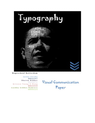
5. Typographic portraits
Typography has also been
used for making amazing
portraits. It is indeed very
impressive that characters
can be used to portray
human faces. The disigner
uses different font sizes and
several colours to make the
portrait beautiful.
6. Street art
Graffiti artists commonly use
text to communicate to their
viewers. They use different
type of typography and sizes
to make their graffiti more
original and appealing.
5) made by Juns Satya in 2012
12. 12
7. Billboards
Like posters, billboards are installed vertically but these are larger than posters. You
can see them along the road or on tall buildings. Billboards are made for advertising
and promoting a product, a company or just anything. Most of them use eye-
catching and striking images to get the public’s attention. A side from the main
picture, it always uses different front sizes and colours.
6) In this billboard, we can see that the
thing that catches your attention is the
“FOREVER 21”the use of typography is
a simple one yet effective. You can
clearly read it and it stands out with the
chosen colour and the size of the
letters.
8. Book and magazines covers
Some books and magazines use typography in their covers to
impart uniqueness and creativity. Now a day, with all the
thousands of different books and magazines, what makes them
even more interesting is the typography art that is used on the
covers. It immediately gets the interest of the readers when is
looks different from the usual.
7) In this cover book, if you look at it
carfully, you can see that the creator of the
cover book has used typography not only on
the word “COVER”but also everywhere on
the picture.
13. 13
9. Album covers
Several albums cover uses images. Usually it would be the
picture of the artists posing according to the theme of his
album. Then there would be a text stating the album title.
Although there are more and more albums you use
typography as a background of the album cover.
14. 14
Bibliography
Google and Images
Wikipedia
"Century Gothic." Wikipedia. Wikimedia Foundation, 21 Nov. 2012. Web. 19 Jan.
2013. <http://en.wikipedia.org/wiki/Century_Gothic>.
"Color â  What Is Color?" Crayola.com. N.p., n.d. Web. 21 Jan. 2013.
<http://www.crayola.com/for-educators/resources-landing/articles/color-
what-is-color.aspx>.
"Creative Use of Typography in Print Ads." - Speckyboy Design Magazine. N.p., n.d.
Web. 20 Jan. 2013. <http://speckyboy.com/2012/01/13/creative-use-of-
typography-in-print-ads/>.
"Font." Wikipedia. Wikimedia Foundation, 22 Jan. 2013. Web. 22 Jan. 2013.
<http://en.wikipedia.org/wiki/Font>.
Strizver, Ilene. "Select Your Language." Arial vs. Helvetica. N.p., n.d. Web. 21 Jan.
2013. <http://www.fonts.com/content/learning/fyti/typefaces/arial-vs-
helvetica>.
"Typography." Wikipedia. Wikimedia Foundation, 22 Jan. 2013. Web. 22 Jan. 2013.
<http://en.wikipedia.org/wiki/Typography>.
"Typotheque Type Foundry - High Quality Fonts for Print and Web." Typotheque
Type Foundry - High Quality Fonts for Print and Web. N.p., n.d. Web. 19 Jan.
2013. <http://www.typotheque.com/>.
"What Is Typography? Learn the Basic Rules and Terms of Type!" Creative Bloq. N.p.,
n.d. Web. 19 Jan. 2013. <http://www.creativebloq.com/typography/what-is-
typography-123652>.