1. The strap line featuring Zac is a The masthead is found in the same position on each magazine this helps
The magazine has a slogan which again helps
key convention that most create a brand identity. The colour used in the masthead is a different
distinguish the brand identity. The fact that “more
magazines include. The short shade to the rest of the magazine yet it’s bolder and noticeable with a
gossip” is seen clear may be more of an interest to the
sentence shows the audience white background covering each world. The masthead is written in
audience as they love gossip on their favourite artists.
what to expect of the article with lowercase with a sort of bubbled effect with it almost like it has been
The “s” at the end is written in an unusual way which
Zac included. The feature article hand written and coloured. This can portray that the magazine could be
can connote quirkiness. The “tm” above indicates the
photo of him smiling makes the written by someone similar to the target audiences age giving them a
trademark of the magazine and any other variables
audience feel that he’s smiling at sense of connection as they see life in their eyes. This is comforting for
associated with “Top of the Pops”. The image above is
them, with a speech mark coming the reader.
along side the masthead it appears to be a short of
out as though he’s having a
speaker indicating that this magazine is the first with
conversation with the audience.
the latest news of artists and their new songs. It can
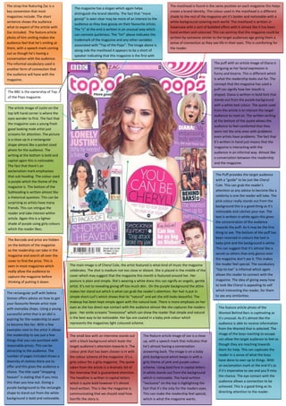
The informal vocabulary used is The puff with an article image of Diana is
also portray that the magazine is associated to music as
another form of connection that intriguing as her facial expression is
it may represent a speaker.
the audience will have with the funny and bizarre. This is different which
magazine. is what the readership looks out for. The
concept that the magazine has used a
puff can signify how her mouth is
The BBC is the ownership of Top
shaped. Diana is written in bold font that
of the Pops magazine.
stands out from the purple background
with a white text colour. The quote used
The article image of Justin on the
from the article is to interest the target
top left hand corner is where the
audience to read on. The written writing
eyes wonder to first. The fact that
at the bottom of the quote allows the
the magazine uses a young fresh
audience to feel comforted that they
good looking male artist just
were not the only ones with problems
screams for attention. The picture
even artists have problems. The fact that
is a close up in a rectangular
it’s written in hand just means that the
shape almost like a pocket sized
magazine is interacting with the
photo for the audience. The
audience in an informal way. Almost like
writing at the bottom is bold and
a conversation between the readership
capital again this is noticeable.
and the magazine.
The fact that there’s an
exclamation mark emphasises
that sub heading. The colour used The Puff provides the target audience
is purple which the theme of the with a “guide” to be just like Cheryl
magazine is. The bottom of the Cole. This can grab the reader’s
Subheading is written almost like attention as any advice to become like a
a rhetorical question. This can be celebrity is one the reader will take. The
surprising as artists have many pink colour really stands out from the
friends. This can intrigue the background this is a good thing as it’s
reader and take interest within noticeable and catches your eye. The
article. Again this is a lighter text is written in white again this gives
shade of purple using girly colours the concentration of the audience
which the reader likes. towards the puff. As it may be the first
thing to see. The bottom of the puff has
been reversed in colours the text is
The Barcode and price are hidden
baby pink and the background is white.
on the bottom of the magazine
This can suggest that it’s almost like a
so the readership can take in the
secret so others that only glance over
magazine and search all over the
the magazine don’t see it. This makes
cover to find the price. This is
The main image is of Cheryl Cole, the artist featured is what kind of music the magazine the reader feel special. The vocabulary
seen in most magazines which
celebrates. The shot is medium not too close or distant. She is placed in the middle of the “top-to-toe” is informal which again
really allow the audience to
cover which may suggest that the magazine this month is featured around her. Her allows the reader to connect with the
capture the magazine before
posture is plain and simple. She’s wearing a white dress this can signify an angelic, gentle magazine. The idea of giving away how
thinking of putting it down.
artist. It’s not to revealing giving off too much skin. On the purple background the attire to look like Cheryl is appealing its self
makes her stand out which is what can grab the reader’s attention. Her hair is put in which interesting the reader, for them
The rectangular puff with Selena
simple short curl’s which shows that its “natural” and yet she still looks beautiful. The to see any similarities.
Gomez offers advice on how to get
your favourite female artist style makeup has been kept simple again with the natural look. There is more emphasis on her
with everyday shops. Using a young eyes as she has direct eye contact with the audience almost like she captures the readers The feature article photo of the
successful artist that is an idol is gaze. Her smile screams “innocence” which can show the reader that simple and natural Wanted Behind Bars is captivating as
aspiring for the readership to want is the best way to be noticeable. Her lips are coated in a baby pink colour which it’s unusual. As it’s almost like the
to become like her. With a few represents the magazines light coloured scheme. audience is able to receive information
examples next to the artist it allows from the Wanted that is selected. The
the readership to see just a few image of the boys reaching to escape
The small box with an interview stands out The feature article image of Joe is a close
things that you can purchase with can allow the target audience to feel as
with a black background which leads the up, with a speech mark that indicates that
reasonable prices. This can be though they are reaching towards
target audience’s attention towards it. The he’s almost having a conversation
attracting to the audience. The them for help. This can captivate the
colour pink that has been chosen is in with answering back. The image is on a baby
number of pages included shows a reader in a sense of what the boys
the colour scheme of the magazine. It’s a pink background which keeps in with a
diversity of clothes there are to have done to own up to things. With
girly colour for a girly magazine. The quote girly theme of pink and purple colour
offer and this gives the audience a an exclamation mark at the end it’s as
taken from the article is a dramatic bit of scheme. Using bold font in capital letters
choice. The title used “shopping if it’s imperative to see and you’ll miss
the interview that is guaranteed attention. in white stands out from the background
heaven” is stating that if you miss the chance. The eye contact with the
The headline is written in capital letters which is noticeable. The hand written
this than you lose out. Giving a audience allows a connection to be
which is quite bold however it’s almost “exclusive” on the top is highlighting the
purple background to the rectangle achieved. This is a good thing as its
hand written. This is like the magazine is fact that it’s the only for the readers eyes.
shape to stand out from the white directing attention to the reader.
communicating that we should read how This can make the readership feel special,
background is bold and noticeable. horrific the story is. which is what the magazine wants.
2. The sub sections lure the The puff provides information that entices the
The top of the masthead
target audience with the reader to look inside. The word “exclusive”
outlines what in inside of
The Slogan on the below of the saucy “bits and bobs” they grasps the audience as it allows the readership
the magazine. The
masthead gives another implement managed to get off artists. to feel unique as it’s only for their eyes. The
“uncensored” is written
that the magazine is centred on This can be mostly about puff is bright neon pink to grab attention of
hand like. This can create
music. The rhyme is catchy and their past present or future. the audience. It is kept with the colour
an informal touch
simple. This also shows other artist scheme of the magazine. The use of
towards the magazine
included in this feature. vocabulary is to make sure the target
almost comforting the
audience familiar with how trendy the
target audience.
magazine is with the target audience.
The two giant posters have
been emphasised as they are
The small puff on the left side of for both female
the magazine is a cleaver entertainment. However there
technique as the audience always isn’t much emphasis on the
looks on the top left hand side of a FREE posters. This is another
page. The vocabulary is to fit the way in which the target
audience to ensure they feel as the audience is attracted to the
magazine understands them and magazine.
they can relate. The colours are
bright and vibrant to ensure it
stands out. This ensures attention
towards the rest iof the cover.
The barcode and price are
hidden to the right side of
The masthead is found in the same the magazine. This makes
place each week this ensures the the target audience search
brand identity of the magazine. The the cover to find the price.
colours again distinguish the brand This will allow them to have
identity yet also keeping with the a review of the magazine
target audience’s preference of and what there is to offer
colour. It is again on left hand side inside.
so it can be in the mind of the
readership. Using “we” within the
title ensures that the reader can
feel a part of the magazine and The magazine uses the target
have a sense of belonging. The audience language so there’s a
symbolism of a heart instead of “connection” between
simply writing the word can create another as well as making the
informal mood and language which audience feel comfortable.
relates towards the audience. This This is shown in the language
also links to the fact that the title is used by “Boy, oi, oi!” The fact
enclosed within a text bubble it that the magazine is giving
uses the same language as the free posters of “fit” famous
target audience would in a text. male artists instantly grabs all
The title is short, sweet and cool. attention to the posters. The
colours again are kept within
the scheme. The writing is
bold and capital so it’s
The feature article photo is used to
noticeable.
advertise what type of bands and The puff featuring clothes which is in the next season offers
artist are included in the magazine. advice on the latest trendy clothes for the summer. The bright
The artist featured on the front cover
The concept of saying “Unseen Pics” colours give a more in season look giving the reader
signifies the magazine celebrates Pop
gives the readership a special feel awareness on what items are too come within the magazine.
music. Jessie J is the main image of the
that they are exclusive. Using The colour of the text featured within the puff has the same
magazine, on a white background which
informal language also allows the tone which keeps the magazines identity. It keeps to a colour
allows her to stand out. She’s facing
readership to have a connection to scheme which is important so the magazine doesn’t have too
towards the reader and making eye
the magazine. The use of many different colours. The title in pink again keeps in with
contact in a way that, wherever you
“Bromance” and “4eva!” are both the magazine colour scheme it’s also bold and capital so it can
wonder her eyes follow. This is a good
another slang term the magazine grab attention. The “sorted” is underlined emphasising that
advantage that the magazine has as it’s
used to implement that the the magazine has everything you could ever need for summer.
most likely to grad the target audience’s
magazine offers what the target This is what the different items of clothes in the puff are
attention. Her posture is as if the kiss that
audience are looking for. portraying.
she blew out is for the reader. The make
up used on Jessie J is simple yet
emphasising her features such as her eyes
Her pout is a very common pose that most of the readers use when taking a picture. This may suggest that even artists are like
the dark eye liner and the lashes
the readers. Her face is simple almost natural to her skin colour. Her hair is simply straight yet keeping her famous “bangs”
emphasise her eye colour which is
almost like her signature hair style. However this was a “Cleopatra hair style” which she has incorporated into her own. This can
attracting as she is looks like someone to
indicate to the reader that simple is best. The simple attire that she is wearing is quiet casual and feminine, which shows that
aspire to be. Her lips are coated with a
designer clothes are not always what artists have in their wardrobe. The hoops are another famous signature by Jessie J giving
baby pink who is matching the scheme of
her identity to the magazine. With Jessie J as the main image the reader can get an idea that this month’s magazine has
colours used with the magazine. This is
exclusivity to Jessie J.
also seen on her nail colour.