Call Girls Near Taurus Sarovar Portico Hotel New Delhi 9873777170
Digipak avril
1. Digipak Analysis
For my third digipak analysis I have decided to analyze the album “the best damn thing” by Avril
Lavigne. Avril is known to be in the genres of both pop and punk which I think she indicates to
the viewers in this album in several different ways. This album is her third album and she has
continued her image of the pop rock princess but has changed her image slightly to keep the
audience intrigued by dying her hair bright blonde with a pink streak to suit the album cover and
give herself a new look to go with the new album.
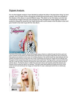
The front of the cover is shown above and straight away a theme is visible through the fonts used and
colour scheme of pink black and white which give both the rock and girly image which she is known for.
Her posture and position on the cover of not being directly in the centre shows her rebel attitude with her
clothes and large amount of eye liner she is also contributing into giving an insight into her attitude and
the genre of her songs being both pop and punk at the same time. The logo which is set around the text
also fits in with the colour scheme and gives the same vibe which I think Avril is trying to give across to
sell the album. The fact the album is titled “the best damn thing” will hopefully attract the viewers into
looking at and buying the album as intended. The plain white wall background keeps the focus of the
cover on Avril and continues her image as it looks like it’s near a skate park which she is notoriously
known for.
2. The back of the album is shown above showing a close up of Avril in the centre of the back cover wearing
similar clothes and dark eyeliner to continue with the theme. She is looking in the direction of the songs
on the left which could be an indication for the viewers to look at the text as she is which gives a
relationship between the text and image. Avril is targeting her audience by knowing the images and style
of text they will generally like and using it on her album cover such as the stars used in the top right hand
corner. The font which is used is almost in a graffiti style which contributes to the punk style Avril has and
is original and specific to her. She has also used a unique quality which shows who has had an input in
each song put in an interesting way for the audience by having a different shape for each person
continuing the theme but letting the audience gain information. The label is shown in the bottom left right
under the songs so that the audience will see it and are then aware of the record label. There is also a bar
code which is shown on all of the digipaks I have looked at on the back of the album which is something I
need to think about when creating my digipak.
Inside the album holds the cd itself and a booklet containing photos of Avril and each of the lyrics for the
songs of the album. The cd continues the theme of the album by being completely pink and having the
logo in the centre of it. This could be so the buyer is able to establish which artist it belongs too straight
away and associate that colour and logo with Avril. The photo still uses the same colours as the covers
but is classier and Avril is looking very sad and miserable which actually fits with the lyrics on the opposite
page of the booklet showing parallels between image and text again.