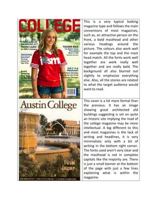
1. This is a very typical looking
magazine type and follows the main
conventions of most magazines,
such as, an attractive person on the
front, a bold masthead and other
various headings around the
picture. The colours also work well
for example the top and the mast
head match. All the fonts work well
together are work really well
together and are really bold. The
background all also blurred out
slightly to emphasise everything
else. Also, all the stories are related
to what the target audience would
want to read.
This cover is a lot more formal than
the previous. It has an image
showing great architected old
buildings suggesting is set on quite
an historic site implying the read of
the college magazine may be more
intellectual. A big different to this
and most magazines is the lack of
writing and headlines, it is very
minimalistic only with a bit of
writing in the bottom right corner.
The fonts used aren’t very clear and
the masthead is not in complete
capitals like the majority are. There
is just a small banner at the bottom
of the page with just a few lines
explaining what is within the
magazine.
2. This magazine is tailored specifically
for the sports fans of the college
not only mentioning about the local
college teams but also the national
sports heroes that the typical
reader would aspire to be like. It is
a bit of a mess with fonts and
colours as the clash of yellow, blue
and orange doesn’t really work that
well. The lead image is different to
those you see on most magazines
because it is not posed, it is an
action shot which is quite fitting for
a sports magazine. The writing its
self is set all around the pictures
and is all related to different sports.
The cost price and barcode is in the
bottom right which is conventional
for most magazines.
This magazine is extremely
feminine with lots of pinks and
whites and females being the main
focus on the front. There is a
headline running across the front
with a brief explanation this is
conventional however the 3
pictures with headlines are a bit
different as other stories are usually
layout around the lead image.
There is also a logo of the college in
the bottom left hand, personally I
think it would have looked better
on the right hand corner but it is a
good idea to have as it shows it
relates to the college. The fonts are
also quite young fonts that would
appeal to a more teenage/young
adult audience than most other
fonts.