
Recommended
More Related Content
What's hot
More from JoanneMulgrew
Creating a Thriller Style Title for My Film Trailer
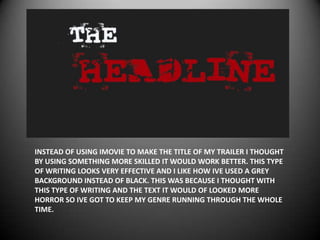
- 1. INSTEAD OF USING IMOVIE TO MAKE THE TITLE OF MY TRAILER I THOUGHT BY USING SOMETHING MORE SKILLED IT WOULD WORK BETTER. THIS TYPE OF WRITING LOOKS VERY EFFECTIVE AND I LIKE HOW IVE USED A GREY BACKGROUND INSTEAD OF BLACK. THIS WAS BECAUSE I THOUGHT WITH THIS TYPE OF WRITING AND THE TEXT IT WOULD OF LOOKED MORE HORROR SO IVE GOT TO KEEP MY GENRE RUNNING THROUGH THE WHOLE TIME.
- 2. IM UNSURE ABOUT THIS STYLE OF WRITING AS IT COULD EITHER WORK OR IT COULDNT IF ITS USED IN THE CORRECT WAY THEN IT WOULD WORK WELL ON THE TRAILER. SOME FONTS MAY NOT JUST BE USED FOR THE TITLE OF THE FILM COULD BE USED IN WORDS/CREDITS ON THE TRAILER ETC.
- 3. I REALLY LIKE THIS STYLE OF WRITING AS ITS QUITE A THRILLER TYPE WRITER STYLE. THE PRINK LOOKS VERY EFFECTIVE ALSO COULD IMAGINE IT ON A THRILLER NEWSPAPER. I WILL BRING THIS UP WITH THE REST OF THE TEAM TO SEE IF THEY LIKE IT AND HOPEFULLY WE CAN WORK WITH IT. A DOWN SIDE TO THIS FONT IS THAT WITH THE STYLE AND COLOURS BY FIRST REACTION SOME MAY SEE IT AS A HORROR.
- 4. THIS STYLE WORKS VERY WELL AS THE ‘HEADLINE’ ACTUALLY STANDS OUT WHICH IS THE IMPRESSION I WANT WATCHERS TO SEE. A DOWN SIDE TO THIS IT LOOKS SLIGHTLY COMIC AS IT REMINDS ME OF ‘DENNIS THE MENNIS’ BUT IF I USE IT THE CORRECT WAY COULD LOOK VERY EFFECTIVE.