
Recommended
More Related Content
What's hot
What's hot (20)
Viewers also liked
Similar to Evaluation Question 2
Similar to Evaluation Question 2 (20)
Evaluation Question 2
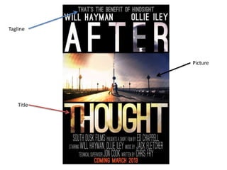
- 2. Any good poster includes a tagline to give a brief insight to the film. The tagline can be a quote from the film or a short sentence to describe the film. In our case we have quoted a line from the film that also describes the basic idea of our film, a person questioning his choices after an event has happened. This tagline leaves the viewer wondering its meaning and how its relates to the film, perhaps making them want to watch the film to understand.
- 3. The central image is often one of the first things that are seen. In our poster the central image tells a lot about the film. This picture may be fairly simplistic but is design can tell the viewer a lot about the film. It is clear that the film is about a conflict between two characters as they seem to be fighting. The two contrasting colours show that there is a good and bad side, which is created through the association we have with the colours. The most interesting and effective part of the image is the symmetry. By doing this it draws the eyes to the middle creating a focal point. The two characters.
- 4. The title is the most important part of a poster as it is what draws people in. By adding the characters faces as the background of the title we have created a more layered title that encourages the audience to look closer. The characters faces are often images used in posters as people spot the actor and therefore look at the poster. We wanted to include this but in a more subtle way. The way the characters are facing each other echo the ideas of conflict and the colour schemes match to associate each character with ‘good or evil’ distinguishing which is the antagonist and which is the protagonist.
- 6. The fact file enable readers to find basic information about the film such as key cast members. By including this we are able to quickly advertise the film to the readers. Fans of the cast or director will be eager to find out how they have done on this project and therefore read on. Seeing the name of the writer or director enables readers to form assumptions on the style of the film based on previous encounters, before the even read the review.
- 7. The use of pictures act as small teasers to draw the audience in. They show scenes from the film so that the audience can briefly see the style of the film without giving too much away, as well as acting as a visual aid to things that have been talked about in the review. The picture choices for our review do this well. The main picture shows Wesley and Lucas fighting, showing that the film includes action sequences. The broken mirror is a hint towards the idea of reflection, however the reader will not know this without watching the film and therefore are left wondering what it is about.
- 8. The whole point of a review is to rate a film, so most reviews include a visual rating system to back up what has been written. Some writing styles mean interpreting the writers exact opinion difficult. A visual rating similarly to the fact file allows readers to gauge the film and more importantly exactly what the writer thought. We have chosen a star system , as it is the most common one and therefore easily recognisable. Alongside this we have include a brief quote from the writers opinion to act as justification for the rating.