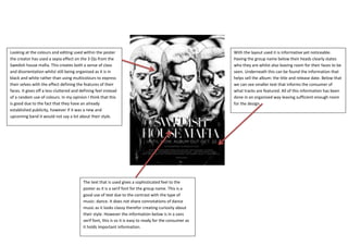
1. Looking at the colours and editing used within the poster With the layout used it is informative yet noticeable.
the creator has used a sepia effect on the 3 Djs from the Having the group name below their heads clearly states
Swedish house mafia. This creates both a sense of class who they are whilst also leaving room for their faces to be
and disorientation whilst still being organised as it is in seen. Underneath this can be found the information that
black and white rather than using multicolours to express helps sell the album: the title and release date. Below that
their selves with the effect defining the features of their we can see smaller text that informs the consumer of
faces. It gives off a less cluttered and defining feel instead what tracks are featured. All of this information has been
of a random use of colours. In my opinion I think that this done in an organised way leaving sufficient enough room
is good due to the fact that they have an already for the design.
established publicity, however if it was a new and
upcoming band it would not say a lot about their style.
The text that is used gives a sophisticated feel to the
poster as it is a serif font for the group name. This is a
good use of text due to the contrast with the type of
music: dance. It does not share connotations of dance
music as it looks classy therefor creating curiosity about
their style. However the information below is in a sans
serif font, this is so it is easy to ready for the consumer as
it holds important information.