call girls in Dwarka Sector 21 Metro DELHI 🔝 >༒9540349809 🔝 genuine Escort Se...
Magazine Analysis
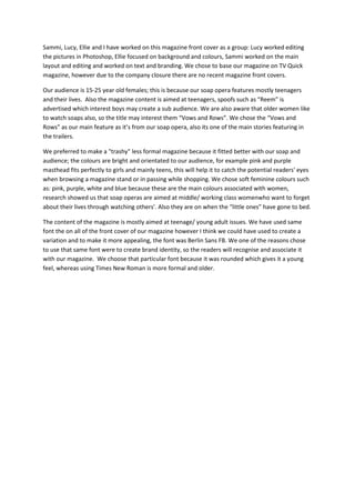
1. Sammi, Lucy, Ellie and I have worked on this magazine front cover as a group: Lucy worked editing
the pictures in Photoshop, Ellie focused on background and colours, Sammi worked on the main
layout and editing and worked on text and branding. We chose to base our magazine on TV Quick
magazine, however due to the company closure there are no recent magazine front covers.
Our audience is 15-25 year old females; this is because our soap opera features mostly teenagers
and their lives. Also the magazine content is aimed at teenagers, spoofs such as “Reem” is
advertised which interest boys may create a sub audience. We are also aware that older women like
to watch soaps also, so the title may interest them “Vows and Rows”. We chose the “Vows and
Rows” as our main feature as it’s from our soap opera, also its one of the main stories featuring in
the trailers.
We preferred to make a "trashy" less formal magazine because it fitted better with our soap and
audience; the colours are bright and orientated to our audience, for example pink and purple
masthead fits perfectly to girls and mainly teens, this will help it to catch the potential readers' eyes
when browsing a magazine stand or in passing while shopping. We chose soft feminine colours such
as: pink, purple, white and blue because these are the main colours associated with women,
research showed us that soap operas are aimed at middle/ working class womenwho want to forget
about their lives through watching others'. Also they are on when the “little ones” have gone to bed.
The content of the magazine is mostly aimed at teenage/ young adult issues. We have used same
font the on all of the front cover of our magazine however I think we could have used to create a
variation and to make it more appealing, the font was Berlin Sans FB. We one of the reasons chose
to use that same font were to create brand identity, so the readers will recognise and associate it
with our magazine. We choose that particular font because it was rounded which gives it a young
feel, whereas using Times New Roman is more formal and older.