
Recommended
More Related Content
What's hot
What's hot (20)
Viewers also liked
Viewers also liked (20)
Similar to Traditional Vibe Magazine Contents Page Design
Similar to Traditional Vibe Magazine Contents Page Design (20)
Traditional Vibe Magazine Contents Page Design
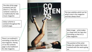
- 1. The title of the page (contents) tell you what it is. The way contents is laid out is a traditionally for vibe music magazine The two subtitles which are for what's new in the magazine and hats always there Colour scheme is constant throughout the content page. Main image - artist makes a v shape with her legs also reminding us that it is a Vibe magazine. There is an outlined V, reminding us that this a vive magazine. Having a V on the contents page is also traditional for vibe magazine. The position of the artist makes the readers feel more involved with the wants going on.
- 2. Traditional V on contents page. Reminding everyone it’s a Vibe magazine. The grey and white colour scheme is constant throughout the magazine, the red heart contrast with the colour scheme really well. The background is basic so the artist (main image) can stand out. Its grey and white so the re heart is drawn to attention. Contents has been written in a unique way. And with the bold font it catches your eye quickly. The use of different types of font stands out – it makes the magazine look more classy and formal.
- 3. Magazine title appears on contents page The date the magazine was issued The magazine uses features so we know what's in the magazine. Doesn’t have a contents page sign. The text in bold is to attract the readers attention, with a normal font with a little background story Pull quote relating to the main image. Gives an insight of the interview The main image stands out because the background is plain The main images shadow, attracts the reader.