eCommerce AOV How to Show the Data To Measure Marketing Effectiveness
•
0 likes•177 views

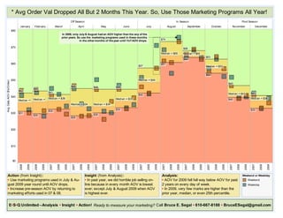
Data Viz Alternatives to "Box & Whisker" / "Candle" Plots. This is a quick and dirty chart I produced in response to a question about how to create box and whisker charts in Excel. It shows an alternative based on a cycle chart structure. It shows year to year data for one month at a time from Jan to Dec. This alternative shows a little more information at a glance - monthly seasonality and compare data year to year.