Accurat, 8 steps for powerful dataviz
•
23 likes•9,612 views

this presentation analyzes and dissects the process and the method behind the data visualizations we publish on Corriere della Sera (La Lettura). How to build powerful, multi-layered visual stories? We here share our point of view: everything runs around the concepts of layering and making hierarchies clear, for both the data analysis (the stories we want to tell) and the visual composition (main architecture and aesthetic value).

Recommended
Recommended
More Related Content
Similar to Accurat, 8 steps for powerful dataviz
Similar to Accurat, 8 steps for powerful dataviz (20)
Recently uploaded
Recently uploaded (20)
Accurat, 8 steps for powerful dataviz
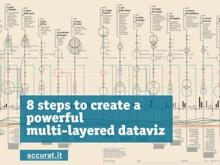
- 1. 8 steps to create a powerful multi-layered dataviz accurat.it
- 2. Accurat who? Accurat is an agency and consultancy based in Milan and New York. We design experiences of interaction between people, information and contexts. We do this by analyzing data, contexts and contents and creating dynamic and static data visualizations; editorial products, interactive platforms and mobile tools.
- 3. our visualizations on La Lettura: This presentation is about a data visualization column we regularly publish on La Lettura, the Sunday cultural supplement of Corriere della Sera (the main Italian newspaper).
- 4. Multi layered dataviz? This presentation dissects the process behind our data visualizations: How to build powerful, multi-layered visual stories?
- 5. rule n.1: stay informed! Every week we choose a topic we think is particularly interesting to explore, ranging from current affairs and news to historical or cultural phenomena; we then analyze different kind of datasets trying to identify a main story - hopefully a non common one - that is worth to be told through a data visualization. (Story is always the key.)
- 6. how about the story? it has to be: catchy + clear + provide several layer of exploration: non-linear storytelling, where people can get lost in details, elements and sub-stories.
- 7. rule n.2: think about a non linear-layered storytelling Everything runs around the concepts of layering and making hierarchies clear, for both the data analysis (the stories we want to tell) and the visual composition (main architecture and aesthetic value). “ if we consider our collective presentation as composed of the pieces within a tale, we aim to build a singular “greater- story” built through the layering of sub stories, or story components.
- 8. the layering process: (1) Composing the main architecture of the visualization (2) Positioning singular elements within the main framework. (3) Constructing shaped elements of dimensionality and form (4) Elucidating internal relationships between elements. (5) Labeling and identifying elements (6) Supplementing the greater story through the addition of “minor or tangental tales” elements. (7) Providing small visual explanations such as a legend or key (8) Fine-tuning and stylizing of elements shapes, colors, and weights to make hierarchies pop out.
- 9. be patient: we will show you our dataviz, we promise.
- 10. the layering process: (1) Composing the main architecture of the visualization - the formalized base through which the main story will be mapped and displayed, - upon this one we’ll see the most relevant patterns emerging from the story: the essential “map” that shall conceptually identify where we are. (This base is essentially a matrix or pattern that will serve as our organizer. It may be composed of cells, or distances, or other interrelated multiples.)
- 11. the layering process: (2) Positioning singular elements within the main framework. this process is also one which will test the effectiveness of the main architecture: - the placement of elements reveals or confirms weaknesses and strengths which may lead to modification of the main architecture.
- 12. the layering process: (3) Constructing shaped elements of dimensionality and form - As these elements have form they must also be identified through colors, shapes and dimensions according to opportunities to establish categorizations, thus advancing clarity and relationships that serve to enhance the story.
- 13. the layering process: (4) Elucidating internal relationships between elements. - these links, directives, and qualifiers serve to give the story a comprehensive texture and correlate dependencies within the story.
- 14. the layering process: (5) Labeling and Identifying elements Labeling and Identifying through the addition of explanatory labels and short texts provides requisite “last mile” clarity throughout the presentation.
- 15. the layering process: (6) Supplementing the greater story through the addition of “minor or tangental tales” elements. We consider this a very important step to contextualize the phenomena in a wider world. These components link the story to external ideas, other times, or other places. Elements that are rendered here may come from very diverse sources— analysis that is undertaken once we have strongly established the core story. These elements must not distract from the main story.
- 16. the layering process: (7) Providing small visual explanations such as a legend or key this is to assists readers and the general public who may not be familiar with norms of data visualization. The process usually involves simplification of the general architecture (e.g. the x and y axes, base timelines, or map components) as well as minimal explicit shapes, colors, and dimensions of singular elements. These explanations also provide units of measurement for distances and volumes, etc.
- 17. the layering process: (8) Fine-tuning and stylizing of elements shapes, colors, and weights to make hierarchies pop out. Highlighting the relevant and visual constructing other several background layers of information should bring information selectively and sequentially revealed, helping readers discover stories by themselves and recognizing the patterns or interrelationships from one element within the story to another them all and the process beyond them.
- 18. ok! but now show us your dataviz!
- 19. you can see the whole collection here: http://visual.ly/users/accurat but we’ll now look closer at each individually!
- 20. Subterranean veins of Europe Have you ever thought about going from London to Paris riding the tube? How long are the underground veins that run below major cities in Europe? With this visualization we compare the total length and fares of the different subway systems across the continent, revealing interesting insights and confronting the actual sizes on the map.
- 21. The visualization is based on a map locating each city in its actual position, where we simply cut the geographical morphology in order to enlighten this imaginary idea of traveling below the earth. Each city is represented by a circle the radius of which is the total length of its subway extension. The main tale is immediately recognizable: which cities are overlapping or so close to one another that they may almost be reached by subway?
- 22. The visualization then provides lots of other information, so that each city subway system could be compared and readers desire could spend additional time: - daily consumption (number of passengers represented with light pictograms), - the colors of the lines (numerically ordered and represented by colored tiny squares), - the cost of one-way ticket (indicated by the stroke thickness of each circle), (And we also represented cities like Valencia which underground lengths is minor that 20 km, just by simply locating this black dot on the map, and we did this because it's funny to see some of them that could be reached from other cities' underground systems.)
- 23. It’s then suggested that a possible evaluation of estimated distance from Milan (where Corriere della Sera is headquartered) with white (cutting the background) light lines pointing Milan as the center.
- 24. Then, on the right Zoom bottom part of the page we also added further visual comparisons: using the same metric scale of the main visualization we tried to give readers an idea how the actual length of all the metropolitan lines (and so subterranean veins of Europe) is; comparing it with the Danubio river, with the main Italian (and well known) highway; with Alps mountains total lengths and with the Tour de France as well.
- 25. (back to the overall view)
- 26. Painters’ time This dataviz has been inspired from an article by Malcolm Gladwell published in the New Yorker, in which he tries to unveil the rules behind creativity and genius, comparing those artists that succeeded very early in their career, the young geniuses like Picasso, with those who had to wait until their mature years and had to practice way more to see their true art take form, Was it possible to draw a timeline that showed in what period of their lives the most famous painters of all times painted their masterpieces?
- 27. The general architecture of the visualization was then clear to us: painters should have been situated along a timeline (enlightening centuries)and located within the main architecture according to teir birth yeard, the painter “entity” is represented as the line of the lenght of his life, with fertiles periods defined within 3 main parts: young (up to 35 yo), adult (36 to 60 yo) and mature (61and over), normalizing intervals according to the average life expectancy for each century.
- 28. We then defined our own criteria to define which paintings to consider as a masterpiece: - (1) for each painter we positioned on life-line first the “official” point of view of which peace the Italian edition of the Garzanti Art Encycloped refers as the master; / which is the one that you see squared - (2) secondary we put also a level of“people’s” choice; the first result related to the name of the painter on Google Images. / which is the other one, not squared The depiction of the painting was an opportunity to add further layers of information, the main colors of the art piece within the squares, size of the frames (actual sizes of the squares) and the painting technique with a small grey symbol,
- 29. The guys that you see just named in grey, as Jason Pollock here, with just his birth year below, was because of the fact that at a certain point we had a problem: 90 painters: really too many if we want to maintain an overall clear and legible composition!! We came back to our art expert at Corriere della Sera asking him to select the 45 that could be considered real milestones. Within the visualization we represented the 45 left painters anyway by positioning their name and birth date on the chart in the correct position, so that we were able to make this further content available to be explored by readers even if with less details.
- 30. Trying to look at the big picture of the story we wanted to tell we felt the urge to suggest patterns’ changing in time with a reference table enlightening main colors, tecniques, sizes changing through centuries as well as the average age of painters producing their masterpieces.
- 31. Zoom Final step was to create a clear and easily understandable legend explaining how to read the visualization, and how to get around the shapes, colors, and symbols. And this part is very important as well. Making a clear legend is really very difficult: you have to really sum up and make all the design choices you had “abstract”, for whom is not into your datasets.
- 32. Painters’ time the final effort is to provide a final graphic fine-tuning: which is a very last step that delivers the visualization with its final beauty.
- 33. Painters’ time (backstage) Let us then just for this visualization show you some backstage parts. - so at thevery beginning we thought that the time (centuries and life of the painters) could have been horizontal, - we always try different mock-ups to see how everything it fits. but actually as you could probably see here horizontal depicted painters with horizontals names / surnames, is not really providing clearness to the overall.
- 34. Painters’ time (backstage) Piero della Francesca 1412 Storie della Vera Croce Sacra conversazione 1492 There was something not convincing to us, and we tried to rotate everything 90 degrees. - yes: actually before trying on digital, we everytime sketch (lots lots lots of sketches): to us, ideas came always with pens and paper before opening a white new illustrator page.
- 35. Painters’ time (backstage) Here is when we decided to put the temporal dimension in vertical, and we here tested the overall locating ust the painters that were in a kind of very dense situation. this vertical lines, to us, better give you the idea of “life lenthgs”, of something with a beginning and an end. (we know it could be very subjective as a point of view, but it’s part of the game!)
- 36. Painters’ time (backstage) Well then, here is the moment when we try to see if everything will fit, before actually putting real contents on the picture: so you can see that the main architecture is defined. there’s space for reference tables and legend.
- 37. Painters’ time (backstage) and then we start refining. putting the background and exact data, that confirmed that a lot of space is left in the upper right part
- 38. Painters’ time (backstage) and another step here: trying to deal with legend and reference table
- 39. Painters’ time final version and here we are with the final versio: and you see that legend is kind of popping out because of the darker background that we choose. and to us now hierarchies are quite clear. and we’re finally happy :-)
- 40. ok, we got it, please go quicker
- 41. January if you want to be a football player January if you want to be a football player explores the idea of a “relative age phenomenon”, and if such is verifiable even for soccer major teams. We reference the author Malcolm Gladwell again, respective to his book Outliers, where he describes how he found a very high concentration of hockey-players born in the first months of the year, particularly in the youngest leagues.
- 42. This is supposed to be because of the sport selection rules of the western system: children are divided into classes based by the year of birth: “bigger” ones are most likely selected for higher leagues and so have more chances to practice at higher levels while they’re growing, this ends up in a huge disproportion in the distribution of months of birth even in the NHL.
- 43. First 30 european major footbal team are located within the horizontal line, ordered by their results in last European Championship. The main visualization (with triangles) explores the number of players borned in the differen months (vertical line) for each team. the orange triangles are for the young league the pink triangles are for the most famous / oldest league
- 44. January if you want to be a football player and finally, we can spot this “relative age” pattern as well in soccer teams, if we look the the overall!
- 45. January if you want to be a football player As always, further details could be explored and useful to compare. then in this case we used the main visualization as a reference to start with the legend, that is actually corresponding / left side / to where we placed elements in the visualization
- 46. quicker, please.
- 47. I’m Montalbano! In I’m Montalbano we visualized the development of the character of Commissario Montalbano throughout all of the 19 novels written by Andrea Camilleri, exploring meaningful trends in the fictional life of the police chief. each vertical line that you see is one of the 19 books, ordered by publication date, and starting and ending with the actual incipit and end sentence of the book. the lenthg of the line of the book is given by the number of pages.
- 48. Time machine for art movies Time machine for art movies explores the 52 best movies of all time, according to the British Film Institute (http://www.bfi.org.uk/news/50-greatest-films-all-time), and investigates the relationship between the year of release and the time-setting of the story. Further details (provided close to the time-setting of the story) show interesting patterns on genres, durations, reality vs. fantasy, nationality, and awards over time.
- 49. Visualizing the future Visualizing the future bases on a selection of speculative fiction captions collected here: (http:// www.theawl.com/2012/08/a-timeline-of-future-events) by Jane Hu. The visualization analyses 62 foretold future events. Each event is described within main typologies (are they mainly social, scientific, technologic, politic?), exploring the year it was predicted, the genre of the book, the age of the author, and more than all, dividing them into positive, neutral or negative events. Finally, good news, in 802.701 the world will keep on existing.
- 50. Empires strike again Empires Strike Again explores the reason why the biggest empires collapsed. The visualization proposes a new historical, geographical and demographical render of 21 big emperors since 2,500 years ago. Empires are visualized according to the moment and reason of their fall: more information about size, population, govern and geography are visually provided for each one.
- 51. Continents’ showdown Continents’ Showdown creates a new map of the world visually comparing continents and their sizes; rivers, mountains, lakes and island dimensions; cities population, density and even the number of passengers that every year transits on the most important airports. Playing with scales, to make everything actually comparable.
- 52. The More You Study, The Longer You Live What is truly influencing life expectancy? Could it be the GDP per capita? What about the size of the family and the level of education? Is it better to live in a urban environment? We compared many differences of countries all over the world on these topics discovering, through a powerful visual rendering, that it may turn out that the more you study, the longer you live. It might also be possible, of course, that the longer one lives, the more they study!
- 53. a formal journalism based information design and info- spatial aesthetic “A journalist can borrow tools and techniques from literature, and be inspired by great fiction writing, but he will never allow her stories to become literature. That notion applies to visualization, which is, above all, a functional art. The role of an information architect is to anticipate this process and generate order before people’s brains try to do it on their own.” Alberto Cairo, the functional art
- 54. 8 steps to create a multi-layered dataviz write us at: info@accurat.it or give us a call at: Italy +39 338 2977662 US +1 (917) 982 6740 www.accurat.it this presentation takes its basis from the article we published on: PIIM Journal Vol.4, 2012, with the precious help of Professor William Bevington.